Making a low-tech site ?
Publication date : October 12, 2020
Authors : Gauthier Roussilhe, Sylvain Julé, Derek Salmon (Pikselkraft)
At a time when the effects of climate change, the transformation of the oceans and the loss of biodiversity are increasingly visible, many questions are being asked about the environmental footprint of digital technology. Today, if we take a look at the French economy, transport, housing, agriculture or energy production, it becomes clear that all of these emit more greenhouse gases than the digital sector. However, of all sectors, the digital footprint is the fastest-growing: energy consumption would increase by 9% per year, greenhouse gas emissions by 8% per year and waste streams from electrical and electronic equipment by 4% per year (this flow does not only contain digital waste). Digital technology seems to increase its footprint without really integrating the environmental constraints specific to our time. So, rather than wondering how digital technology is transforming our world, we wanted to explore what type of digital technology can coexist in a sustainable world. The Low-tech Lab is a national benchmark player in promoting open, accessible and sustainable techniques and technologies.
The redesign of the Low-tech Lab website was a long-term project that transformed with the Low-tech Lab. A team was formed for this task, including Sylvain Julé, designer and web developer, Derek Salmon, developer and SEO expert, and Gauthier Roussilhe, to lead the project and the digital eco-design strategy. This site is the result of the joint efforts of these people and the Low-tech Lab team: Amandine, Solène, Guénolé, Quentin, Clément, Martine and many others.
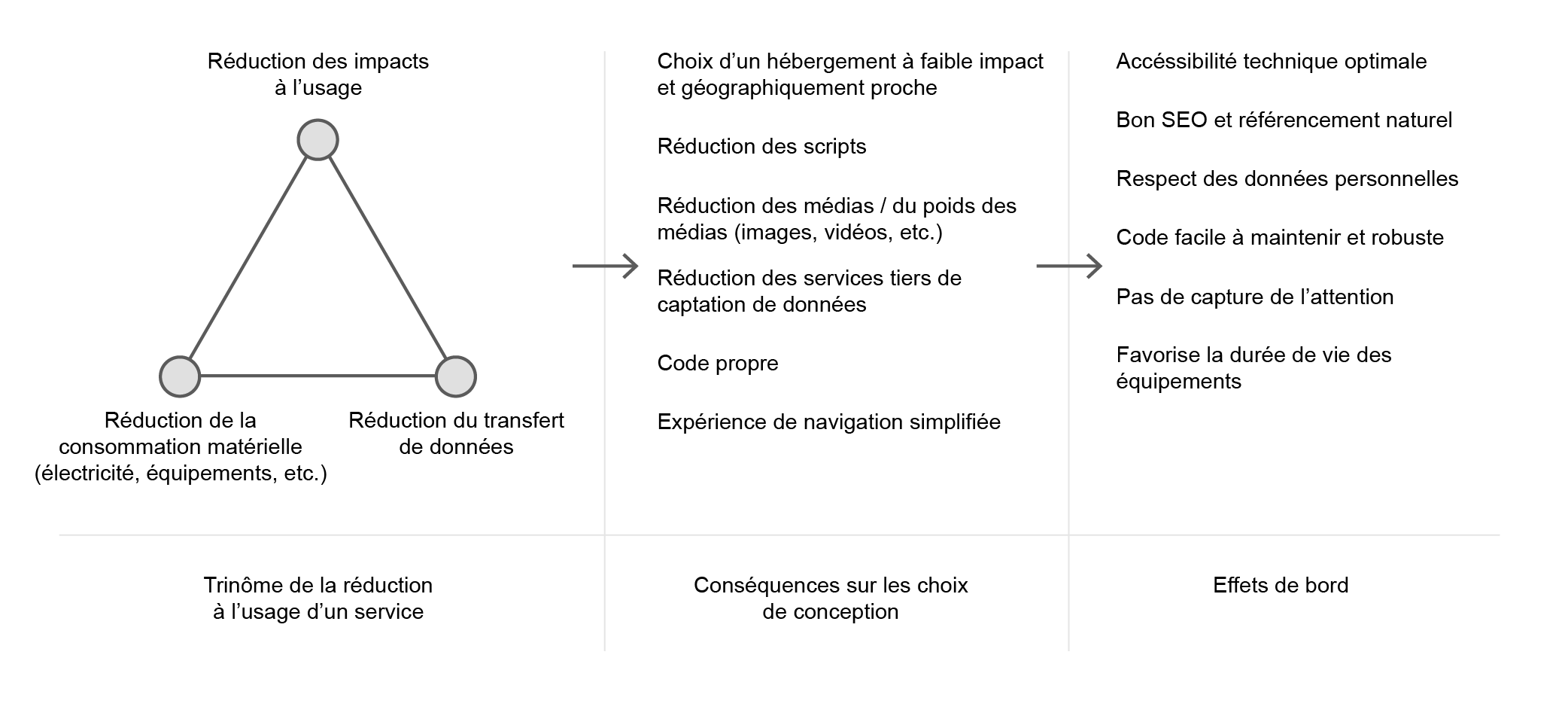
Once the team was put together, we discussed and tried to define what a “low-tech” website could be. The digital sector is by nature anything but “low-tech”. In fact, this infrastructure requires a massive extraction and use of resources to produce computing power and transfer data anywhere in the world. The production of the components integrated into each connected device requires cutting-edge technologies (silicon etching, etc.) and massive investments. As we cannot use the term “low-tech” due to the aforementioned reasons, we have decided to abide by the principles we follow at the Low-tech Lab. A low-tech site is sustainable because the site minimises its environmental footprint and is designed to last as long as possible with little maintenance. Accessible, because the little data consumption of the site allows a larger public to access it regardless of the quality of the network and the model of the smartphone or computer. Useful, because it meets the present and future needs of the Low-tech Lab team and its community. The environmental aspect is preponderant here and structures the design: the general idea is that the reduction of data transfer allows reducing the electrical consumption and the wear of the equipment, which ultimately allows reducing the overall environmental footprint by in terms of greenhouse gas emissions, water consumption and resource consumption.
Re-examine the Uses #
If we decide to use fewer resources, in every sense of the word, then we need to re-examine what our motives are with this site. The Low-tech Lab was rethinking its action and strategy when we started the work. It is not for the Low-tech Lab to be a focal point but rather a point of resources that allows the community to grow on its own terms. It’s less about building a castle than it is about creating an oasis. We have summarised this strategy in a few points to help guide the design:
- continue creating and distributing tutorials,
- allow the low-tech community to grow,
- facilitate the dissemination of resources and information in this community (workshops, events, places, etc.),
- offer a global view of low-tech.
Integrating the new Low-tech Lab strategy does not mean, however, that it must be answered without imposing constraints. In this case, their vision had to be confronted with usage and design parameters that involve trade-offs. We do not respond to all requests blindly because it is above all necessary to define whether this makes sense in an eco-design process. It is not about reducing everything but determining when the investment is relevant. Before even thinking about technical feasibility, it is important to determine two things:
- Is the requested use based on a principle of energy and material abundance, and should be reoriented or abandoned?
- Is the investment in bandwidth, computing power, and therefore in electricity and equipment wear, justified by the quality of use or the value of the interaction for the stakeholders ?
Web design and web development have been largely influenced by the models of GAFAM, whether it is the material design of Google, the design system of Airbnb, the functionalities offered by Facebook, Twitter, etc. It is therefore important not to follow design trends, to question them, and to clearly define what is needed for this project. For example, Google Maps has accustomed us to serving an interactive map before even knowing where to go, in fact, Google Maps has been integrated into the contact pages of many sites. This logic pushed by Google presupposes that the user has the computing power and the bandwidth available to load the map tiles, it is in this that one can consider that this journey rests on a certain material and energy abundance. In order to question usage, we preferred to reverse this type of route: it is not necessary to display an interactive map, however optimised it may be, as long as the users do not know where they are going ( Citymapper understood this at the time). Thus, the initial desire of the Low-tech Lab, which wanted a large global map of all low-tech initiatives, was redirected towards a directory of these initiatives which leads, when the destination is chosen, to an interactive map via OpenStreetMap, if the user wishes. Reversing this course and not going to the default map will have been the subject of many interesting debates between the Low-tech Lab and the design team, identifying and getting rid of bad habits is always a winding process but necessary for the eco conception.
Working with Data #
The Low-tech Lab does not trade in data and does not have advertising space. We were able to get rid of most of the bad practices of the mainstream web, whose main business model is generally based on maximizing engagement, capturing data and selling advertising space.
The analysis of the existing site, its structure and traffic data, was a starting point to frame the needs of the project. The Low-tech Lab uses Dokit to administer its content. Dokit is oriented towards the creation of guides and resources, it is moreover based on a Wiki system (MediaWiki). This system is suitable for managing guides by allowing community participation, a principle similar to Wikipedia. For the presentation pages, directory and resource lists, this system is too complex and creates technical constraints in the organization of content and design. Hence the interest in dividing the structure into two parts: the organization’s website and the Wiki. For the Wiki, technical limitations prevent a reduction in page weight. In contrast, traffic analysis detected spam pages that were consuming resources unnecessarily. Cleaning up these pages and redirects along with improved spam filters has reduced bandwidth consumption, improved site SEO and improved user experience. The traffic analysis showed that the traffic coming from France is dominant, which allows both to open discussions on the communication of the Low-tech Lab and to guide material decisions: in this specific case, the need to have a server close to the majority of users, that is to say in France. This research phase also allowed us to have a discussion about data collection and to abandon Google Analytics.
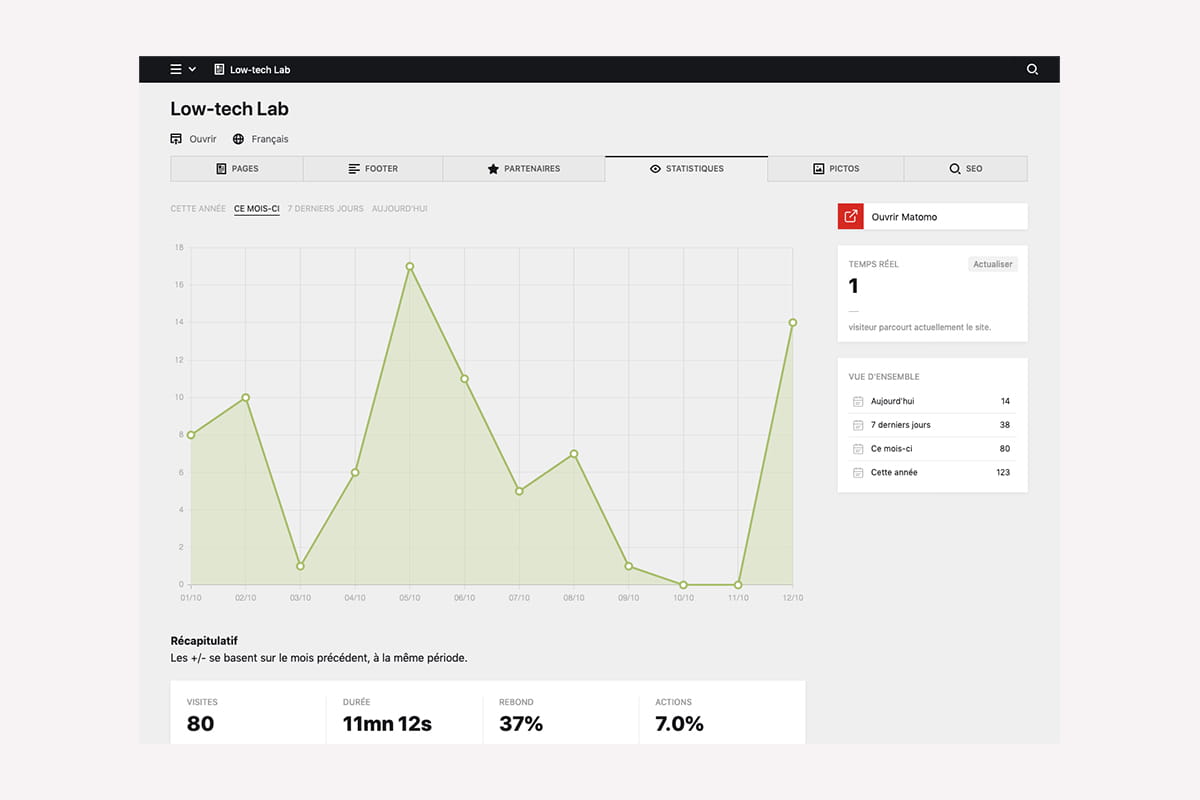
Matomo was selected as a solution instead of Google Analytics for traffic analysis. The major advantage is data control, as we use a Matomo instance installed on our hosting instead of using a third-party service. Added to this is the decision to limit the data collected by anonymizing the IPs (two-byte masking). “Do not track” is also activated. This choice favors respect for privacy but does not have such a significant energy impact. A script is still needed and increases the size of the pages. We can assume a positive impact in the long term, as this data cannot be used by advertising services. This gain is difficult to quantify. This is a point that merits further research and testing of alternatives to reduce this impact.
Recall the Basics of Ecodesign #
We wanted this site to best meet the web ecodesign specifications while exploring new design and interaction choices. One of the reference books to start these steps is “Web Ecodesign - The 115 best practices” by Frédéric Bordage, the Low-tech Magazine is also a reference project. Gauthier also proposed a small guide a year and a half ago on this subject. If we summarize in a few words the approach of GreenIT for the use of a service it is mainly :
- reduce the use of bandwidth,
- reduce the number of requests,
- reduce page complexity (DOM).
The Low-tech Magazine questions the energy autonomy of a site, its low consumption and its inclusion in a given territory. In addition to these points, the ecodesign approach is now mainly oriented towards:
- reduction of technical debt and software obesity,
- the ability to maintain the code thanks to good technical choices (choice of libraries, etc.),
- create the fastest and most efficient user experience possible.
In the English-speaking world, some additional advice on the software approach is available
principles.green. Wholegrain Digital also summed up its approach in 17 tips.
Beyond these few links, we based ourselves on the available literature and our professional experiences to design the lightest site and use the least possible data for the Low-tech Lab. It is as much a matter of accessibility as of optimization: the Low-tech Lab site aims to be accessible to all those who want to visit it, whatever the age and the power of their smartphone/computer and the quality of the mobile network. It is also for these reasons that the design of this type of site is valuable: to create technical accessibility, affordability and not to encourage obsolescence of equipment. This is an important point because most of the environmental impacts of digital technology are found in the manufacture of equipment, and sites such as the Low-tech Lab are involved, at their scale, in delaying their renewal.
Define the Site Design and Content Strategy #
Sylvain intervened both on the graphic design and visual articulation of the content as well as on the development of the whole. This allowed him to quickly identify, as the discussions progressed and the project progressed, the problematic points, the trade-offs to find, and the elements requiring the most technical attention of our original goals. The models interpret the graphic charter updated by the Low-tech Lab internally:
- The articulate text contrasts in accordance with WCAG 2.0 (AA),
- Systematize tailor-made displays by limiting as much as possible (which is, of course, inevitable for very specific content). The structure of the page introductions is identical and comes with or without an image, the detailed sheets share the same model with the blog articles, the lists of resources have a common structure,
- Set up clear but economical content differentiation strategies: coloured backgrounds, changes in column rhythms.
- Use images sparingly, and use them as elements of identity in their own right.
Regarding the selection and processing of content, it will obviously have been necessary to be educational to reduce the number of photos and question the very use of these photos. For example, we didn’t want to display one head per person to introduce the team and instead offered to put a group photo. Finally, the Low-tech Lab team preferred to put nothing and instead focus on the role and skills of each member via keywords for each profile. The images used on the site also have an identity and illustrative value. The idea was to seek a visual treatment which is at the same time a visual signature, by the screening and the use of the strong colours of the graphic charter of the Low-tech Lab, allowing to have a very reduced file weight with low colour output and preserves legibility of images at the scales at which they are displayed. All images on the site (except blog) are .png files and use four colors.
The blog benefits from the special treatment of images. They find here a strong value and thus deviate from the graphic treatment of the rest of the site. However, in order to keep the page weights minimal, we have chosen :
- to display them on the article index only when the user wishes,
- not to display them on this same index when the articles are old (older than 4 months).
In the body of the articles, there are also no restrictions except the parsimony of the editors of the Low-tech Lab, and a deferred loading (when they arrive in the area read by the visitor).
Making Technical Choices #
Which Hosting Service?
As for hosting, we are going for the moment on Infomaniak because it seems to us to be the best current host in terms of environmental, material and social policy. Admittedly, this is not the geographically closest data centre to traffic, but Infomaniak has data centres close to the CERN internet backbone, ensuring excellent connectivity. Ultimately, we would like to host the site locally on a used Raspberry Pi already in use in the Low-tech Lab building. We would like this Raspberry Pi to be powered by the energy of the swell in the port of Concarneau where the team’s premises are located.
A Static Site, or a Dynamic Site?
L’éco-conception web se traduit le plus fréquemment par la conception de sites statiques. Lorsque vous parcourez un site statique, votre navigateur demande à accéder à un fichier html sur le serveur dudit site, le serveur lui renvoie, le navigateur le lit, la page s’affiche. Tout est déjà généré, le serveur n’a aucun travail à faire. Sobre et rapide. Pour 1, 100, 1000 visiteurs, le fichier n’a été généré qu’1 fois.
The problem here is that our site aggregates two different types of content: the content edited by the Low-tech lab team on the site’s content manager (CMS) (Kirby, we will come back to this later) and 3 external databases and collaborative projects designed with Airtable : the LTL library, the events listed in the agenda, and the database of referenced initiatives. We use this list of initiatives (635 at the time of writing this article) as the main material in the low-tech directory and atlas, where we propose to filter them by country (73 at the time of writing this article ) then by geographical area (1 division in place, in France, of 101 departments). Very quickly, it, therefore, appeared that the combination of these options would lead to an architecture of hundreds of static pages and, ultimately, thousands. In this context, it seemed too complex and inefficient to pre-generate thousands of pages and to methodically index them so as to re-generate some of them during updates on one of the 4 connected databases. Laborious and difficult to maintain.
So we decided to go for a dynamic site. When you browse a dynamic site, your browser requests to access a resource on the server of that site, but this resource is no longer present here in the form of a pre-generated file. Instead, the server generates the resource on demand, retrieving the desired texts, images and other content from the databases. It processes/formats them, generates the page, returns it, the browser reads it, the page displays. For 1, 100, 1000 visitors, it will therefore have been generated 1, 100 or 1000 times.
This is where caches become essential. When each Airtable database is called for the first time, the server keeps an internal copy. When needed the next time, the server does not have to connect to a remote database, it has everything at hand. Low-tech Lab editors also have the possibility, via the content manager, to request to refresh the cache of each database in order to update it and put it in memory without waiting for the first request. The same logic applies to pages: when a page is visited for the first time, the server generates it and keeps in memory the file is returned to the browser. On subsequent requests, it returns this file instead of building the page again.
What Choice of Content Manager?
This choice was fairly quick. Sylvain has been using Kirby for several years, for all the reasons that made him a very good candidate for this site: it is a flat-file CMS (without a database, the information is saved in the form of text files on the server) and is therefore very fast, easy to handle and save. It is light, takes up little space on a server (6Mb), has been stable and active for many years and is based on an internal framework: Kirby works with tools developed by Kirby. This is a guarantee of additional stability.
Also, a determining factor is that Kirby allows
the creation of virtual pages from external APIs. In other words, at the cost of a few lines of code, this CMS is able to handle and list our 3 Airtable databases as easily as if it were its own data entered via its interface.
In terms of user experience, Kirby allows for pleasant navigation in the back office that seems unmatched to us today. Inexperienced users get to grips with it very quickly in most cases. You can see what Kirby’s backoffice looks like by going to
this community site.

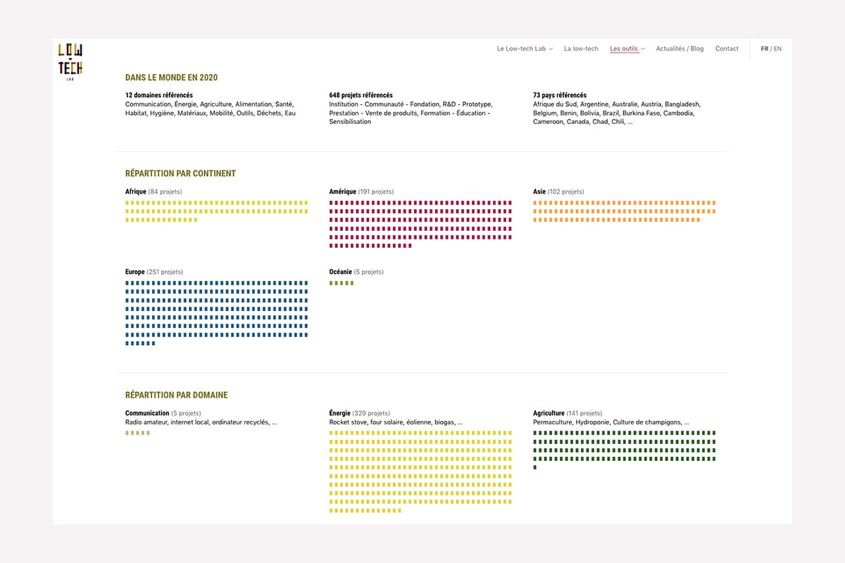
1st Case Study: Visualizing Low-Tech #
One of the challenges of this site was to allow visitors to quickly visualize the distribution, nature and diversity of the initiatives referenced around the world by the Low-tech Lab. The choice of representation here was simple: we will draw from the glyphs of the system font a bullet (a rectangle, rather) which is inserted in each category as many times as there are projects concerned. Thus, representing 100 projects is equivalent to writing a text of 100 characters and fulfils all our criteria: it could not be lighter, does not complicate the DOM, does not require any loading or any request.
Conversely, using a vector symbol would have been problematic. Used in an image tag, it would have sent as many requests as there are chips/colors used (nearly 3000). Embedded directly into HTML as markup, it would have increased our page weight by 3000 × {its size} and made the number of elements in the document even more complex. Finally, representing it with a stylized HTML tag in HTML would certainly have slightly reduced this weight (which would have remained very substantial), but would not have helped this exposure of elements in the document.
All of these initiatives are picked up from Airtable and cached on the server, so Kirby sees them on the same level as their own data. Each data visualization is then also cached, country by country, in both languages, as it is browsed. So when you land on an Atlas page, if it is your first visit and your browser has no cached resources, you are only loading 65 Kb of content. When you then browse the data visualizations of each country, you will only load 10 kb per page !
2nd Case Study: Mapping Low-Tech #
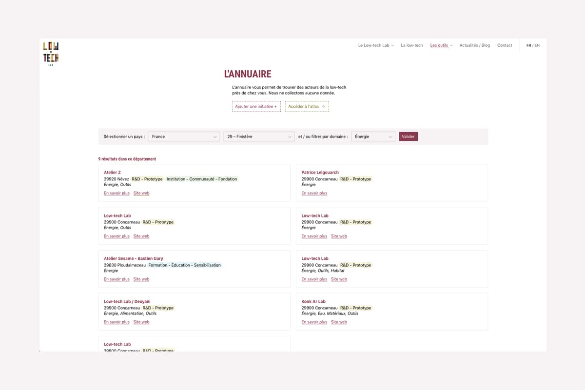
Another challenge for this site is to offer visitors the opportunity to quickly learn about initiatives near their homes. This directory has also been the subject of a lot of discussion and iteration to come up with a solution that ticks all the boxes.
We quickly put aside the cartographic representation libraries as explained earlier in the article. Whether they are vectors (Mapbox) or in the form of tiles (Leaflet), the different basemaps are very demanding in terms of requests and bandwidth. In addition, the ambulatory navigation that this tool would suggest (the map displays a global scale by default, in which the visitor enters zoom after zoom to his location, which loads, scale after scale, new tiles), the weight and the time loading these libraries, we immediately looked for other solutions.
The directory, therefore, requires indicating an entry point (Country) in order to be consulted. All the initiatives (still cached on the server) corresponding to the desired country are then listed, which is a simple filter based on a box explicitly filled in a column of the database. We thus save on geocoding applied to XXX initiatives at the cost of a little time spent structuring the database. From this page and for countries with a subdivision by zone, the user can then enter more detail towards initiatives close to him. In France, this is broken down by department. Here too, this division by zone is explicitly pre-filled in the database, which on the one hand allows the server not to have to manipulate the information (extracting the department from a postal code, for example) before filtering it, and on the other hand, makes it possible to set up a flexible system to accommodate other divisions of countries. For each, we associate:
a standardized/normable division criterion (here, the departments),
a simplified notation for LTL editors (here the department number) and an explicit notation to display it in the filter selector (here the number + the full name of the department),
optionally, a table linking these breakdown criteria (here, each choice of department displays as secondary results the projects referenced in its neighbouring departments).
Visitors wishing to discover initiatives near their home are first presented with a list of initiatives enriched with the project category(s) and domain(s) it encompasses as well as the postal code and name of the city where it is located. is located. If they wish to know more, a direct link to the site of the said initiatives is offered if they have one. Otherwise, a developed sheet briefly presents the initiative and displays a full address: at this stage, and now that the visitor knows where he wants to go, we suggest redirecting him to a map (OpenStreetMap).
Results ? #
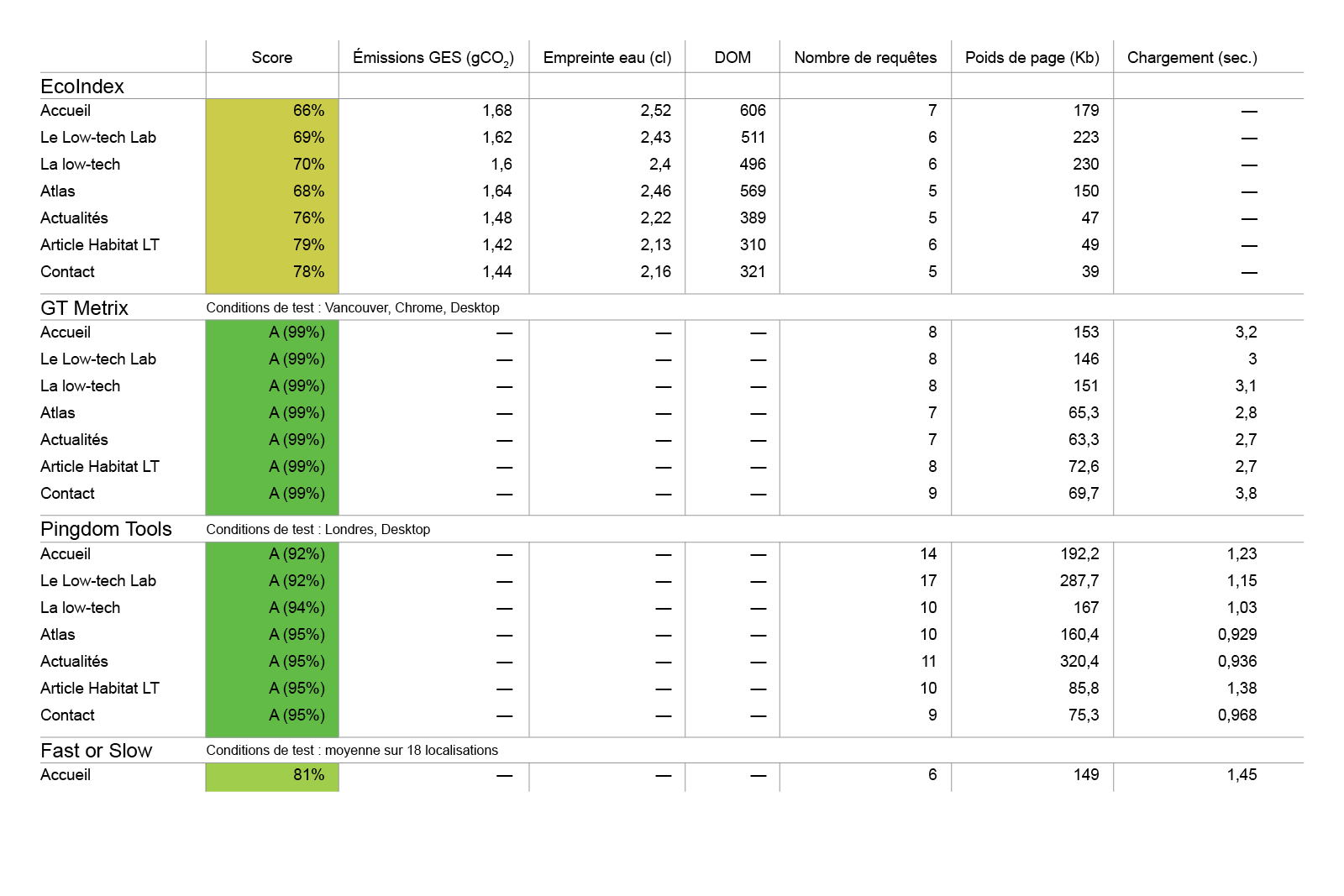
Now that the site is deployed, we will finally be able to audit it to test the relevance of our approach in design and development. For this, we use different performance calculation tools :
- EcoIndex, for the environmental footprint,
- GTMetrix, a performance measurement tool n°1,
- Pingdom Tools, performance measurement tool n°2,
- PageSpeed Insights, performance measurement tool n°3 (Google),
- FastorSlow, to test performance in different countries.
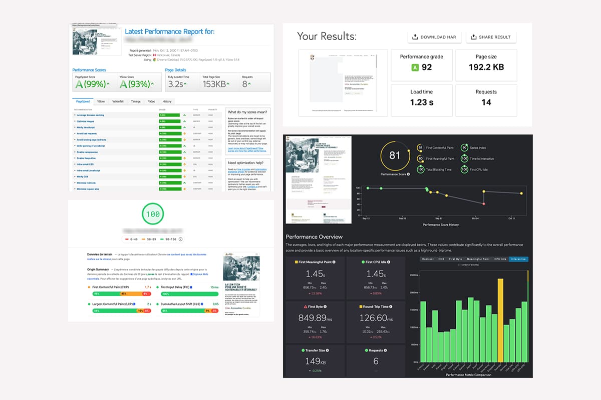
The results speak for themselves; the team’s ecodesign approach achieves top scores on all testing platforms. This means that we have succeeded in our bet on optimization and accessibility. This also means that the natural referencing of the site will be greatly simplified by such scores. We have summarized the scores of a few key pages on EcoIndex and standard performance measurement tools. We can still improve on EcoIndex by integrating some good practices (CSS Ready to Print, etc.).
In summary, a page is 150 kb on average, which is 10 to 13 times less than the web average. We generally stay under 3 seconds to fully load a page on all continents, and less than a second in Europe (good practice sets the threshold at less than 3 seconds). We are well below the average number of requests per web page (74 requests). The environmental footprint for the operation of the site for 1 year will be measured by Gauthier by performing a digital service life cycle analysis (LCA). This is the only way to determine the GHG emissions and the water footprint of the new Low-tech Lab site.
The next stage of the site is local accommodation and the supply of electricity by the swell in the port of Concarneau but this will be the subject of another phase of construction. We also need to let the site live and see how it is handled by the team, the community and all the users we haven’t yet identified. The data collected with Matomo will allow us to validate our assumptions. Additional research work with users (user tests, interviews) would complement quantitative data with more qualitative information. This intermediate phase will lead to completing this publication and sharing new information with the community.
To conclude this article, we would like to thank the entire Low-tech Lab team for their trust, their curiosity and their openness. We are very happy with the result because it helps to show the relevance of usage choices and design choices in low impact web design.